@ Prezi
Prezi Redesign
Five ship-defining projects — a detail page, spellcheck, template chooser, onboarding, and image cropping — for millions of Prezi Next users.
Role
Product Designer
Years
2016 — 2017
Company
Prezi
Overview
At Prezi I worked as a Product Designer in a scrum team building the Prezi Next editor and dashboard. Across a year I shipped five features: a redesigned presentation detail page, an accessible spellcheck, a new template chooser, an in-editor onboarding, and an image cropping tool.
What I brought
01
Dashboard
Redesigned the presentation tile and detail page so people could share, export and monitor performance without opening the editor.
02
Editor Craft
Rebuilt spellcheck, image cropping and interaction patterns that were lost in the jump from Flash-based Prezi Classic to Prezi Next.
03
First-run
Reworked the template chooser and in-editor onboarding to shrink first-time load and give people confidence in the tool.
Project 01
Prezi Detailed View
A details page for presentations, allowing you to share, download and monitor performance.
Problem Definition — People who were regular presenters wanted a way to export and share presentations outside of the editor.
Discovery — We set up interviews with regular users and people just starting out, then mapped usage data against possible entry points. The pattern was clear: these users often just tweaked presentations built by their graphic department and wanted to share them without going into the editor at all.
Ideation — Bring these features to the dashboard where all of your presentations live.
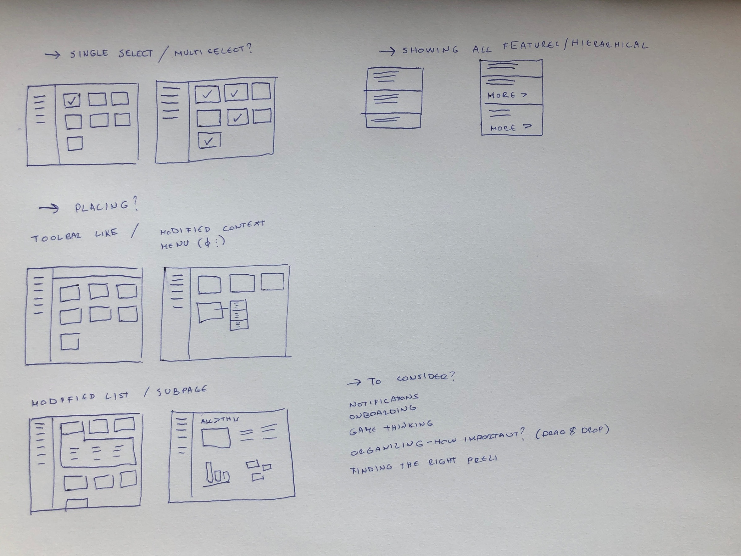
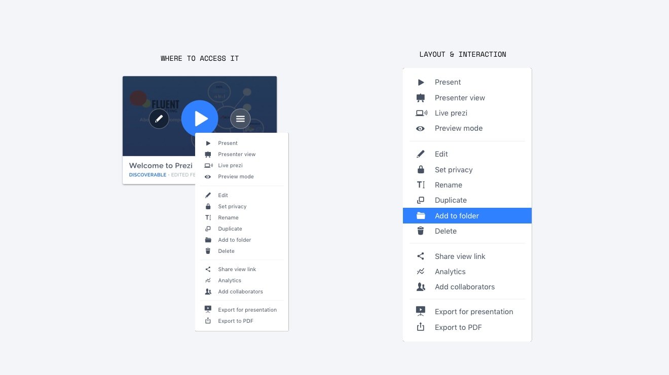
Phase 1 — We already had a right-click context menu on each presentation tile, but almost no one knew about it. The first move was to extend it with the export and share actions from the editor and make it more discoverable.
Phase 2
A dedicated detail page
The context menu was a good first step, but there was very little space to work with and users felt overwhelmed by the options. For the second iteration we settled on three guiding principles: lay everything out with enough room to breathe, display analytics data alongside the presentation, and make sharing and PDF export more prominent.
People either shared presentations by sending a link or by attaching a PDF to an email, so those two use cases moved to the top. Interviews had shown people struggled to see whether their audience was engaging, so viewer analytics needed a home in the same view.
We tried a subpage layout because it gave us plenty of room. Analytics already existed on a separate page, so instead of integrating it immediately we shipped a CTA to see if people would follow it.
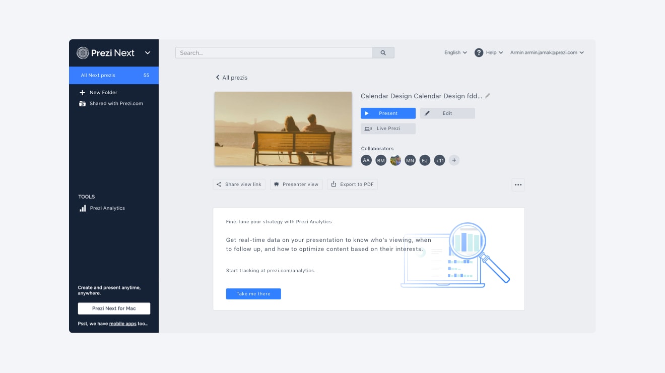
The first version of the detailed view we put out for A/B testing.
Refining
Cleaning up the details
After two weeks of A/B testing, traffic to analytics increased significantly, as did sharing and PDF exports. But we weren't fully satisfied — the existing style guide had low-contrast issues and default buttons looked inactive, and the layout needed another pass.
In the final version we cleaned things up, tightened the hierarchy, and integrated analytics directly into the page.
The refined detail view in action.
The final animation and menu of the spellcheck.
Project 02
Spellcheck
Creating a spellcheck and recommendation option for the Prezi Next Editor.
The Problem — The original Prezi editor had a spellcheck, but when Prezi Next was introduced everything had to be rewritten to move off of Flash. Flash was out, and so was the spellcheck.
Starting Out — A great spellcheck has three properties: highlighted words are clearly visible for people with vision impairments, on old screens, and in bright light; the recommendation engine only shows relevant results, ranked by probability, quickly; and fixing a mistake with one of the recommendations is easy to reach.
Visibility — Red is the expected colour for underlining errors, which introduces multiple visibility problems. Deuteranomaly, the most common form of colour blindness, makes it hard to distinguish reds, greens, browns and oranges — and if the presentation background is red, the underline is invisible. We solved this by drawing a faint second underline in white beneath the red one, which guarantees good visibility across almost any background.
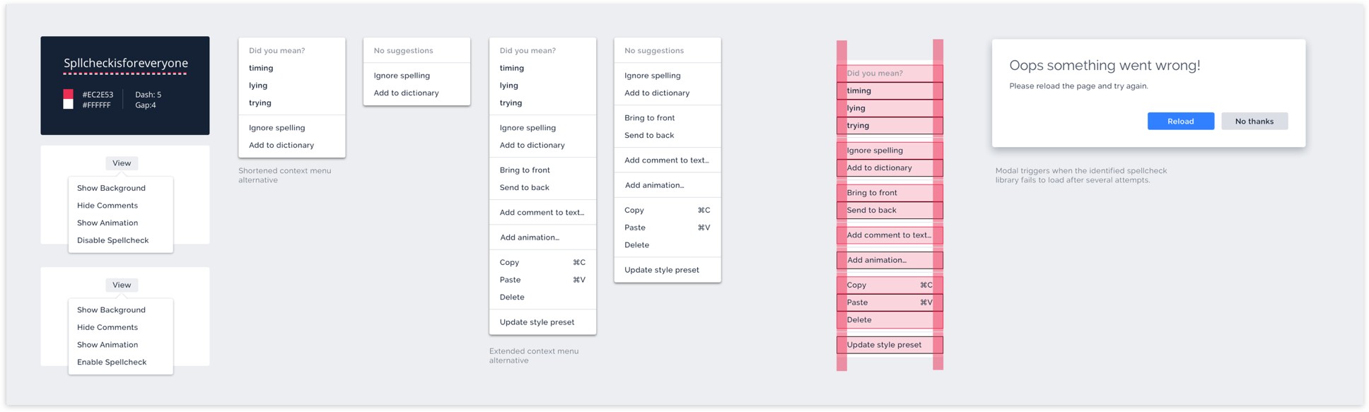
Export sheet and explanations for the spellcheck.
Interaction
Familiar, quiet, and confirming
The interaction had to be quiet but easily invoked. Recommended words live inside the right-click context menu — a pattern familiar to anyone who uses Microsoft Office or Google Docs, which was most of our users.
The animation for accepting a correction gives you a small sense of confirmation that the error was replaced and fixed. All is good, keep typing.
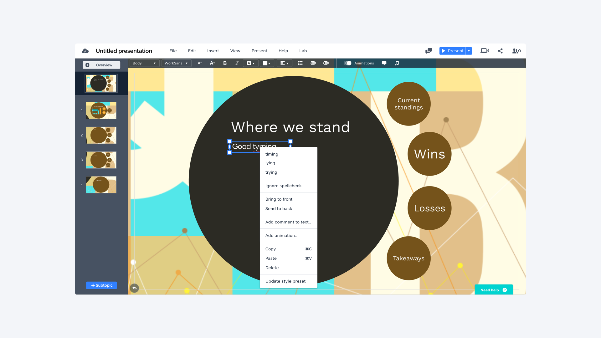
The spellcheck within the editor.
The template chooser in its final form.
Project 03
Template Chooser
A redesign of the Prezi Next template chooser to address several usability and technical issues. The template chooser is by far the most important step in a user's journey — it opens every time you start a new presentation. Building it right gives people confidence in their ability to use the tool.
Problem — Usability tests showed our initial release was not ideal. Previewing a presentation took several seconds, and after selecting one you still had to wait for the editor to load. One in five people left before they even reached the editor. On top of that, another team was creating a hundred new templates and the existing layout could not handle them.
Discovery — I wanted a structure that could handle a lot of content. Because people come from many different fields to create presentations, I focused on grouping by topic and making it easy to browse between options.
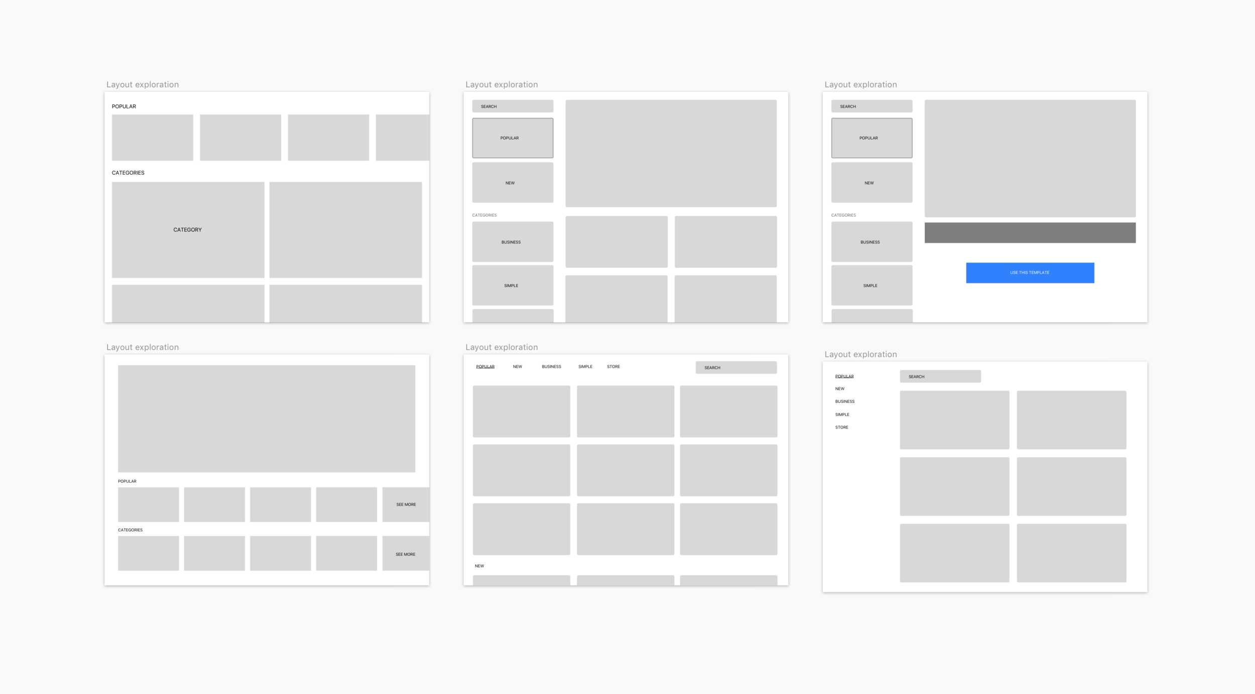
Variations on the layout and structure.
Testing & Implementation
Categories, badges, and a Framer prototype
For testing I picked a solution that allowed free browsing and jumping into categories quickly. Difficulty badges pushed people toward templates with high first-time success rates. A Framer prototype let us see it in action.
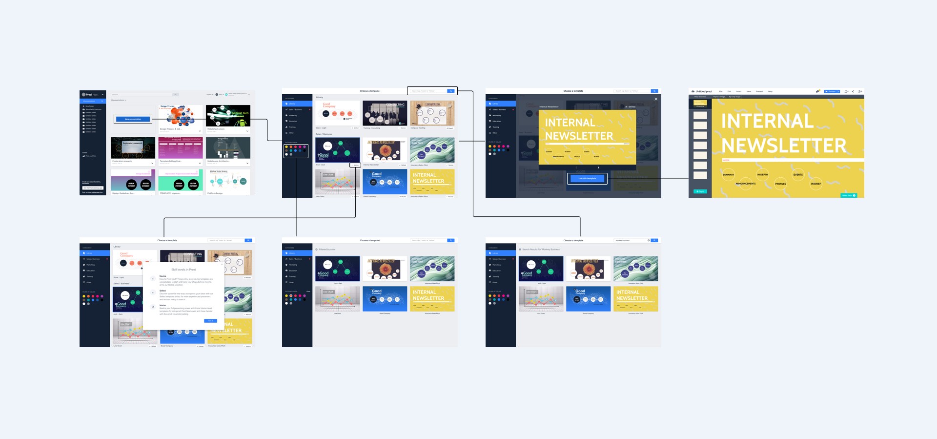
User flow for navigating through the template chooser.
Engineering
From 7–8 seconds to 3
In parallel, the engineering team found a way to cut presentations into short video snippets. Each time a user clicked to the next slide they could still see the transitions and animations without waiting for the preview to load. That also let the actual editor engine load in the background while you browsed — cutting the editor's load time from 7–8 seconds down to 3.
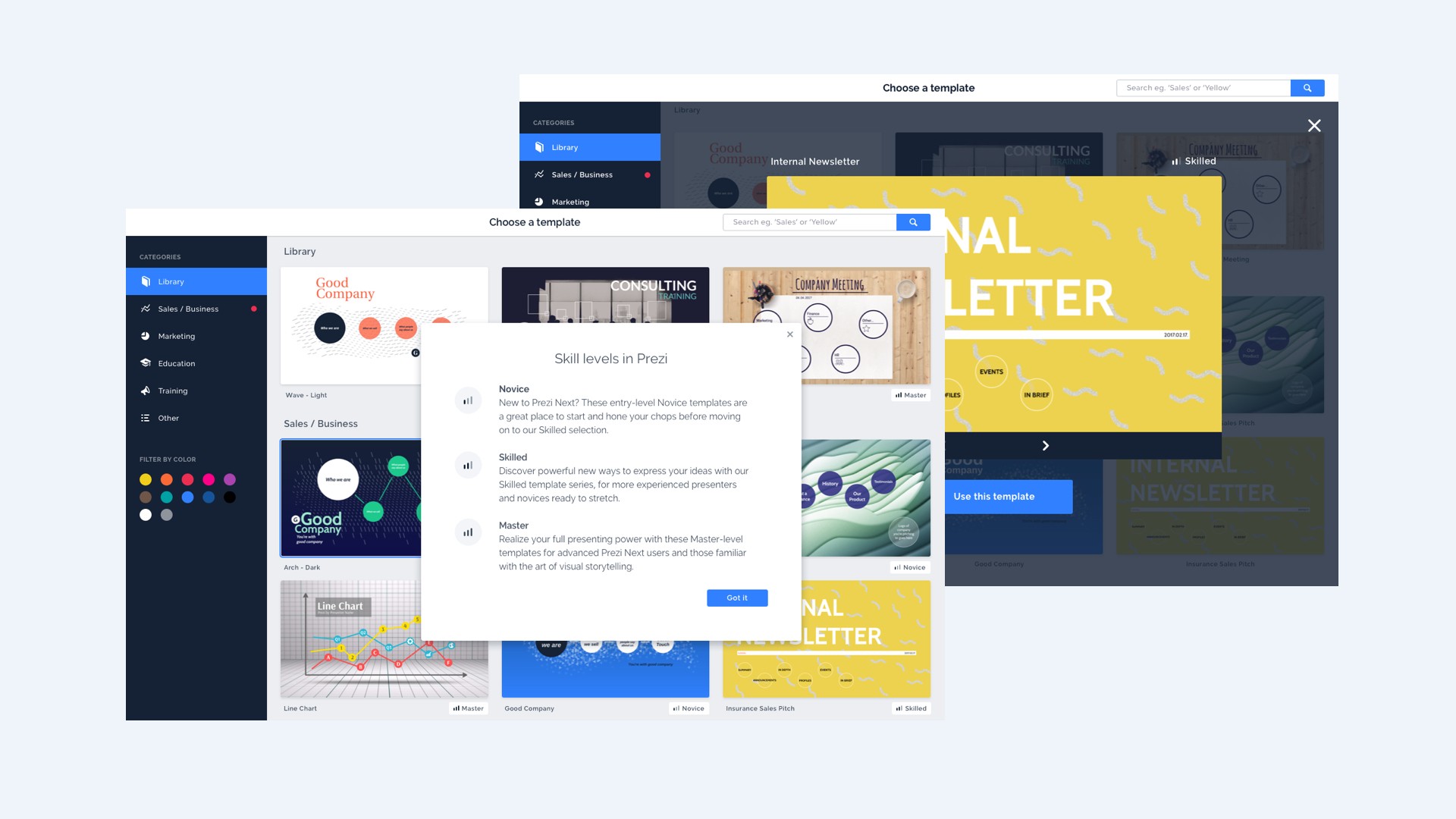
The template chooser skill levels and preview.
Project 04
Onboarding
An onboarding experience to teach people how to use the Prezi Next editor.
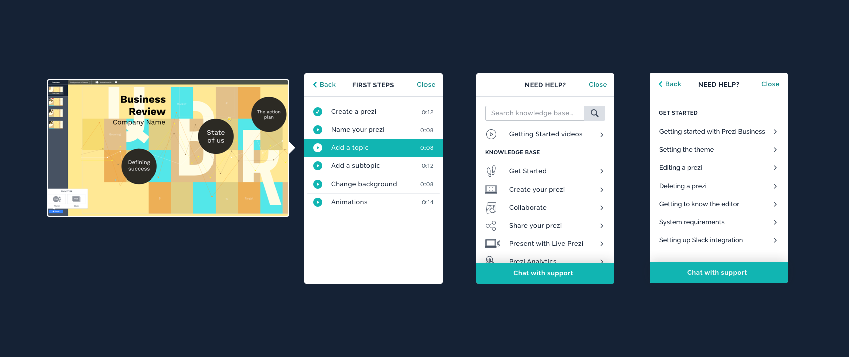
The Problem — Onboarding was always a huge topic at Prezi. The medium is complex; people either get it and love using it or feel intimidated from the start. In Prezi Classic, onboarding was a linear hand-holding flow that alienated a lot of users who preferred to try things on their own.
Discovery — We interviewed 12 marketing and sales professionals about how they learn new tools. It turned out people learn in very different ways: some prefer hand-holding, others jump right in and try a few basic actions. Most rarely tried tools on their own and got almost no training when something new landed in their workflow, so they often had to watch YouTube videos to figure things out.
Approach — We wanted a design that let people follow along or dismiss it entirely. After digging around on Useronboard.com and arguing about Slack's onboarding, one thing was clear: no tooltips. Tooltips take you out of context by forcing you to click somewhere and they're bad if you want to revisit the tutorial. Instead, we took a knowledge-base approach that could be revisited as often as you wanted. Since chat support was already built into the editor, it made sense to build on top of it and take some workload off support.
Project 05
Image Cropping
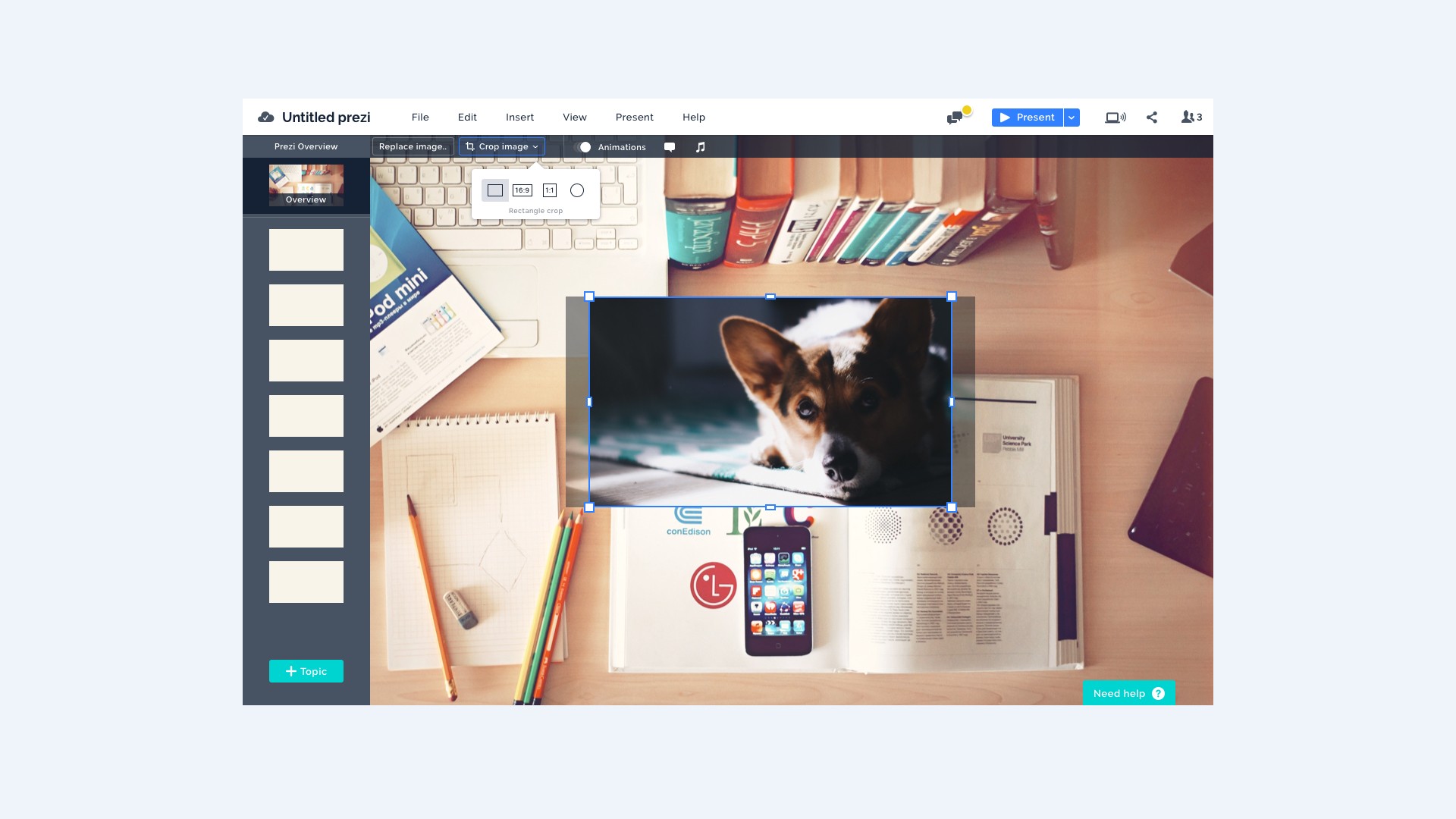
Creating an image crop within the Prezi Next editor.
The Problem — We had an ongoing list of user requests gathered from support tickets, sales calls and usability tests. Image cropping had lived near the top of the list for many months but for some reason it hadn't made the roadmap. We pushed for it with solid reasoning and irresistible charm to put it back where it belonged.
The Design — Most people wanted image cropping to have circle images, because topics in Prezi are circle-shaped by default and people wanted their images to match. A 16:9 ratio was requested for background images and 1:1 for perfect squares.
To build it we had to be consistent with other content manipulation tools inside the editor and familiar enough that it didn't require extensive onboarding. We built it in a test environment first, because the interactions were too complex to replicate faithfully in a prototype and it was important to observe users while they were in the flow of creation. Unfortunately the project was postponed.
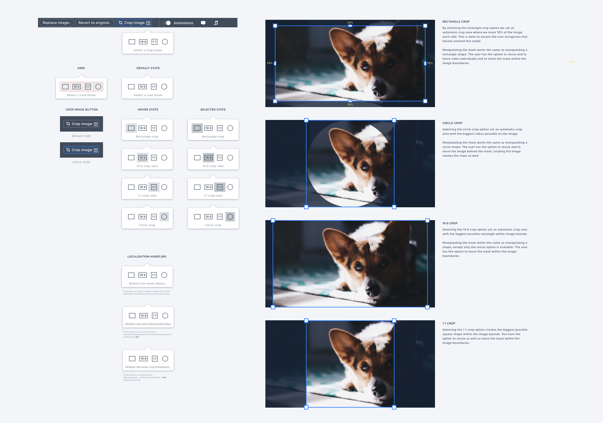
A reference document I created for development.
Team
The people behind it
Project Manager
Arun Manamohan
Tech Lead
Laszlo Pandy
Product Designer
Armin Jamak
User Researcher
Julianna Csuport
Engineering Manager
Christian Sinzinger
