@ Mytaverse
Designing the B2B Metaverse
A full platform redesign, a new design system, and testing every change with real users.
Role
Director of UI / UX
Years
2022 — 2024
Company
Mytaverse
Overview
As Director of UI / UX at Mytaverse my task was to redesign the entire platform, introduce a new design system and branding, and user-test every single change. I led a team of three in a hands-on role.
What I brought
01
User Tests
From initial concepts to features we shipped along the way — every single one was tested with at least four participants.
02
Design System
To ready the platform for public launch I redesigned the entire system and introduced new branding from the ground up.
03
Team Leadership
I led and mentored a design team of three, assigning tasks, planning the roadmap, and shipping my own initiatives alongside them.
Chapter 01
Early User Research
I joined the team shortly after their initial launch. They were still trying to figure out product-market fit — how people were actually using the platform and how to get new users properly onboarded.
To learn more, I conducted 12 interviews with existing users and ran virtual field studies with 6 groups of users entering the world for the first time.
9 / 12
Wanted to use their world to promote or sell a product or service
5 / 12
Struggled with controlling their avatar
4 / 12
Had issues connecting to the audio channel
4 / 12
Had problems navigating the world
2 / 12
Ran into general connection issues
The majority of our users, it turned out, were using the metaverse for commercial use cases.
Chapter 02
Usability Issues
The UI at the time had many issues — people struggled to connect to the audio channel, mute themselves, or navigate the virtual environment.
We wanted an interface that felt closer to familiar meeting tools like Google Hangouts and Zoom. Borrowing those patterns would lower the barrier of entry and make the transition into 3D environments feel natural.
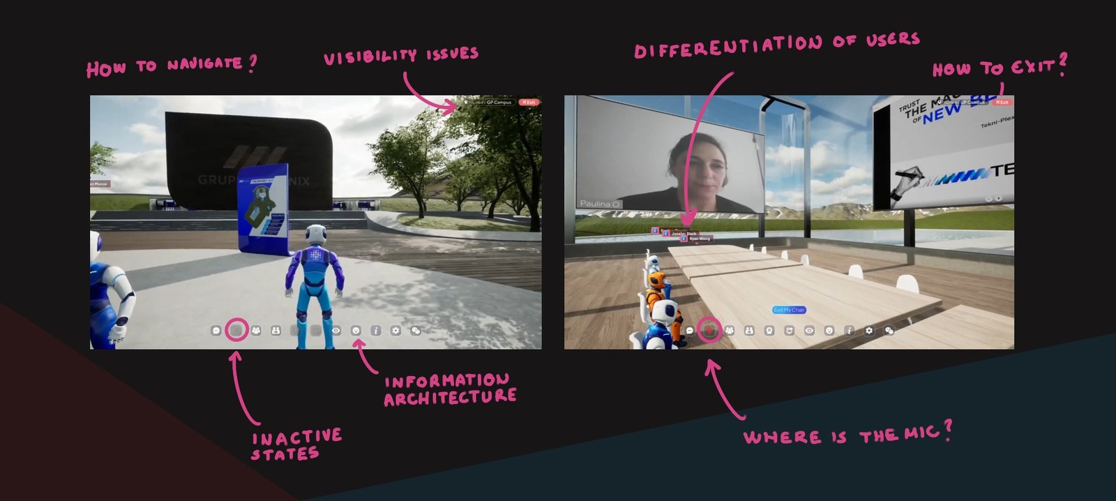
Mapping the pain points across the existing interface.
Chapter 03
Design Sprint
To land on the new UI I organised a three-day design sprint that included development and the executive team. The goal was to understand what our users actually wanted, and to surface the structural issues that got in their way.
We came out of the sprint with two directions worth validating.
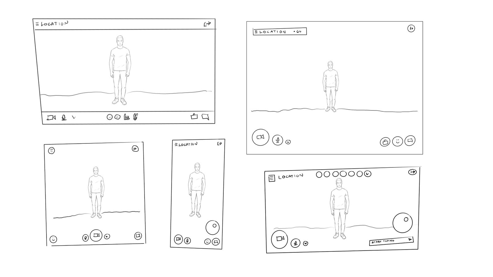
Sprint sketches exploring the new interface layout.
“We need to make entering virtual environments as easy as joining a Zoom call.”
Jaime Lopez
Co-founder, Mytaverse
Prototypes we tested with users to choose the direction.
01
Option A
A traditional layout familiar from video conferencing tools. We tried to keep the barrier of entry as low as possible by leaning on patterns people already recognised — essentially, a Zoom-like frame around the 3D world.
02
Option B
A ‘bubble style’ layout with a horizontal orientation on mobile. It still borrowed from video conferencing, but had a personality of its own — better suited to a game-like environment.
We interviewed 6 users on the prototypes — 3 on Option A, 3 on Option B. Because the transparent bar in Option A obscured the view and users clearly preferred the horizontal layout, we moved forward with the bubble-style version.
The bubble-style layout in motion — the direction we shipped.
Chapter 04
Onboarding
Many users were not familiar with video-game controls, so we ran several initiatives to close that gap. The initial onboarding took place in a virtual lobby where users could try the controls on their own while the main world loaded — with a 3D interactive avatar to practice on.
In parallel we introduced S.A.R.A (Sentient Autonomous Robot Aid) — a helpful bot users could invoke by speech or text at any time. S.A.R.A pulled from the knowledge base and answered in a synthesised AI voice.
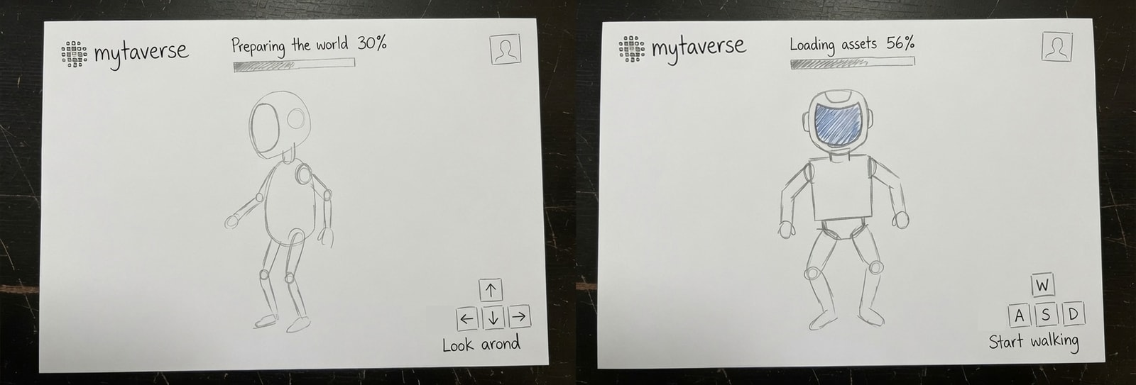
Early wireframes for the onboarding.
Final working prototype of the interactive onboarding.
S.A.R.A — the in-world assistant, in the final visual design.
Chapter 05
Login Experience
Most clients wanted a world they could truly call their own — custom avatar skins, brand colours, and assets running across the interface and the 3D environments.
We also split-tested variations of the login screen itself, exploring which layouts and login options each client preferred.
Wireframe for the non-branded login page.
Character selection screen.
Chapter 06
Video Conferencing
Adding video conferencing was a major milestone. We wanted it to feel three-dimensional: participants appear based on their rotation and distance from the user’s avatar.
As you turn the camera and move around, the video tiles rotate with you — like a compass — always keeping the people facing you in view.
Video previews at the top rotate as you move — always keeping the people facing you in view.
Branded login for Aldar — one of many custom deployments.
Chapter 07
Admin Panel
Creating worlds used to take hours — each one had to be assembled by hand by one of our admins. We wanted to speed that up dramatically.
The result was a modular worlds system with interchangeable facilities and rooms, plus an admin panel where clients can configure their brand, pick facilities on a map, and invite users in a few clicks.
The admin panel lets clients configure their brand across the world.
Selecting facilities on the map and inviting users is a few clicks.
Team
The people behind it
Project Manager
Jaime Lopez
Business Analyst
Jim Stornek
UI / UX Director
Armin Jamak
Senior Designer
Alexander Freinandez
Brand Designer
David Popov